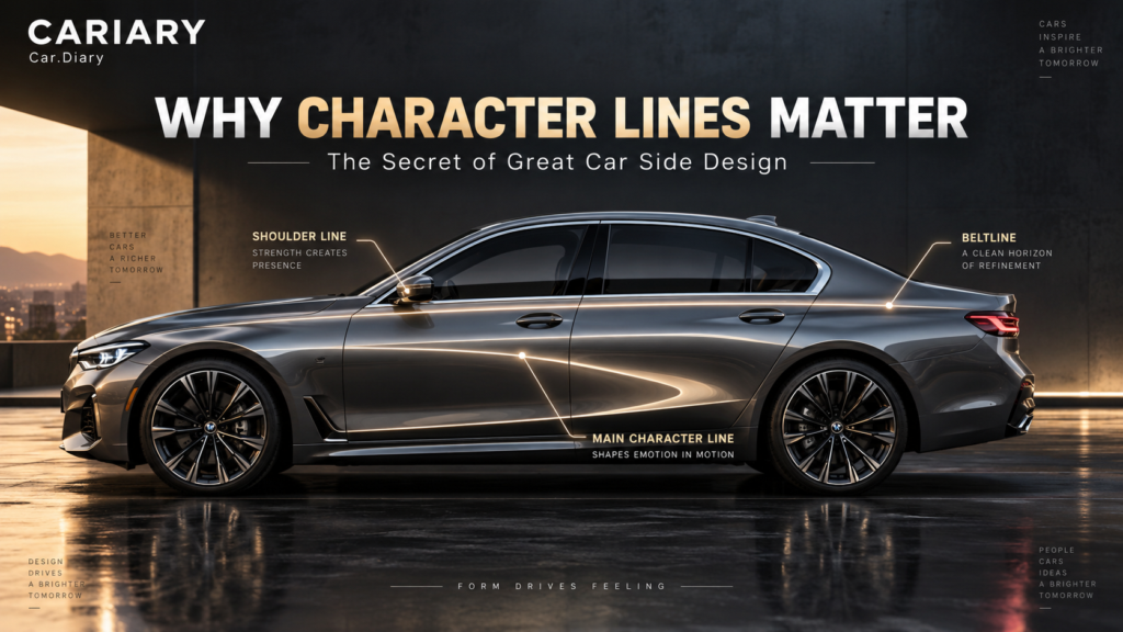
Character lines can make a parked car look ready to move. Another car, with fewer visible creases, can feel almost like a single piece of sculpture. We notice the difference immediately, even when we cannot quite explain what the designer changed.
That was the question we wanted to explore: how can something that looks like one line across a door change our impression of an entire car? The answer starts with a small correction. A designer is not simply drawing on the body. They are shaping a three-dimensional surface that light helps us read.
Our earlier guide to car design evolution looked at the bigger historical picture. Here, let’s slow down and look at the side of one car: its glass, shoulders, doors, wheel arches and the reflections moving across them.
Quick Summary
- A character line is a visual feature in the body surface, often formed by a crease or a transition between curves. It is not necessarily a painted stripe.
- Its position and direction influence perceived proportion and personality, not the car’s actual height, weight or handling.
- A sharp edge concentrates a change in surface direction; a soft curve can create character through broader reflections.
- The best-looking result depends on the whole composition, including wheels, windows, handles and panel gaps. More lines do not automatically mean more design quality.
- The production panel must preserve the intended shape through forming, assembly and paint. A beautiful sketch is only the beginning.
1. Character Lines Start With Surfaces, Not Stripes
Imagine running your hand across a closed door panel. The metal might swell outward, turn through a crisp ridge and then draw inward toward the sill. From a few steps away, that change may read as a line. Up close, it is part of the panel’s shape.
A crease is a relatively abrupt transition in the surface. A character line is a broader styling description: it can refer to that crease, but it can also describe a feature established by a less abrupt change in form. Designers do not always use these terms identically, so treating every visible line as the same physical thing quickly becomes confusing.
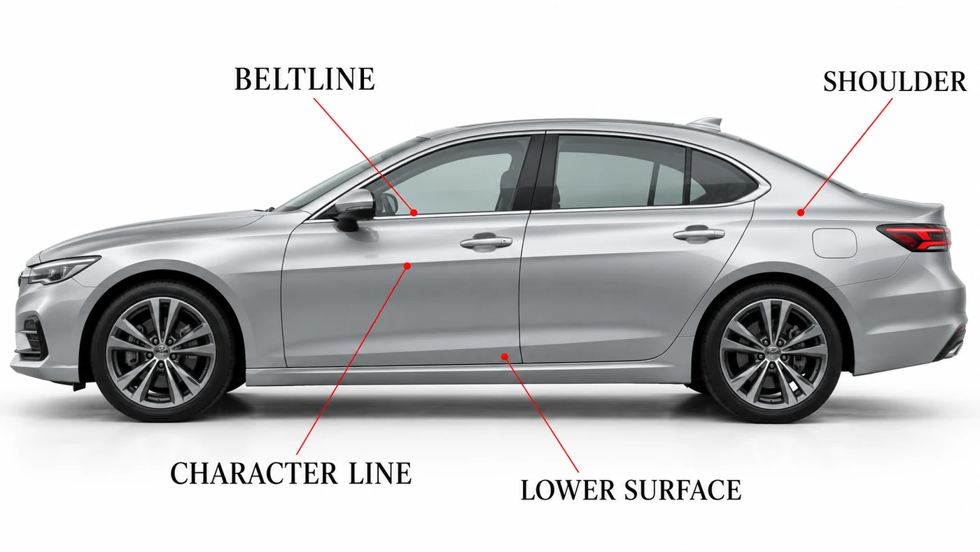
Four Features Worth Separating
| Feature | What to look for | Why it matters visually |
|---|---|---|
| Beltline | The lower boundary of the side windows | Divides the glazed cabin from the body below |
| Shoulder | The upper body volume beneath or beside the glass | Can give the car breadth and a planted appearance |
| Character line | A deliberate feature across the door or fender surfaces | Organizes how we read the body’s shape and direction |
| Lower surface | Sculpting near the lower door and rocker area | Can break up the apparent depth of a tall body side |
The greenhouse, also called the glasshouse, is the glazed upper cabin. A high beltline combined with shallow side glass can make the body feel substantial and enclosed. That is a visual relationship, not a guarantee of comfort, visibility or safety.
The shoulder and a character crease can overlap. Likewise, a line near the door handles is not automatically the beltline. Asking what the feature actually borders or shapes is more useful than memorizing a label and applying it everywhere.
2. Light Makes a Flat Photograph Look Three-Dimensional
We usually judge a car through a photograph, yet we still recognize a bulging fender or a hollowed-out door. Changes in brightness and reflected scenery give our eyes clues about the underlying shape.
A convex surface bulges outward, like the outside of a spoon. A concave surface curves inward, like the spoon’s bowl. They turn toward different parts of their surroundings, so the light and reflections reaching our eyes change across them.
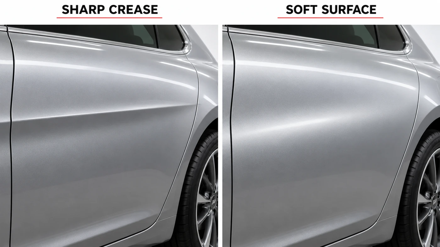
A crisp crease can create a concentrated boundary between two different-looking areas. A gentle transition spreads that change over a wider area. This is why a smooth door is not necessarily an empty door: a shallow curve may do most of its work through a moving highlight rather than an obvious ridge.
It would be too simple to say that the surface above a line is always bright and the one below is always dark. Move the light, move the camera or change the surroundings, and that relationship can change. Glossy paint also reflects objects, not just an abstract wash of brightness.
Mazda’s explanation of its design approach is useful here: the brand treats physical form and the movement of light as connected parts of the design. The important lesson is not that every car should look like a Mazda. It is that removing a crease does not remove the designer’s work.
What Designers Mean by Surface Tension
In styling discussions, a surface can be described as tense, taut or relaxed. Think of the visual difference between fabric stretched smoothly over a shape and fabric hanging loosely. The comparison helps explain the impression; it does not mean the painted metal is literally under the same tension as the fabric.
Visual surface tension is a design metaphor, not a measurement of structural stress. A body panel can look taut without telling us anything about the stiffness of the complete car.
3. One Line Can Change Perceived Proportion
Before looking at the details, we read a car’s basic proportions: where the wheels sit, how long the hood appears, how far the body extends beyond the axles and how the cabin sits on top. Character lines can reinforce or challenge that first impression.
A long, nearly horizontal feature can lead the eye along the side and emphasize length. A feature rising toward the rear can make the body appear more energetic or forward-leaning. Neither is a universal rule: the roof, glass, wheel arches and surrounding surfaces can strengthen or contradict the effect.
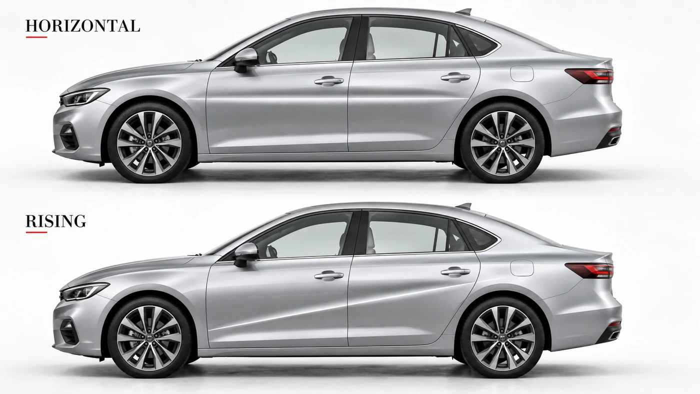
These are interpretations of a composition, not performance data. A car that looks lower has not gained a lower center of gravity. A diagonal crease has not improved its acceleration. There is also no universal percentage of door height at which a line suddenly makes every sedan beautiful.
Body type changes the problem. A tall SUV gives the designer a deep side surface to organize. A lower recess can break up that visual mass. On a sedan, a long horizontal theme may support the wheelbase and roofline. A hatchback’s short body may suit a more compact, rising composition. All three are possibilities, not compulsory recipes.
The Wheels Are Part of the Sentence
A line that appears to grow from a front wheel arch and settle into a rear shoulder can make the wheels feel connected to the body. If the surface above a wheel looks muscular, the wheel may seem more firmly planted beneath it.
This is one reason wheel size can transform a car’s appearance. But visual presence and a better driving package are different questions, as we explored in why bigger wheels are not automatically better.
Proportion also has to coexist with the vehicle’s package: occupants, structure, powertrain or battery, luggage space and other engineering needs. Design and engineering develop together. A crease cannot simply erase an inconveniently tall underlying package.
4. Different Brands Speak Different Surface Languages
Brand slogans become more useful when we connect them to an actual model or period. Saying that one brand always uses sharp lines and another always uses curves misses how much their design languages evolve.
Hyundai: Making the Facets Visible
The seventh-generation Elantra, called Avante in Korea, is a particularly clear example. In its 2020 introduction of the 2021 model, Hyundai described a design built around intersecting lines and angular surfaces under its Parametric Dynamics theme. Its launch explanation specifically calls attention to three lines meeting at one point.
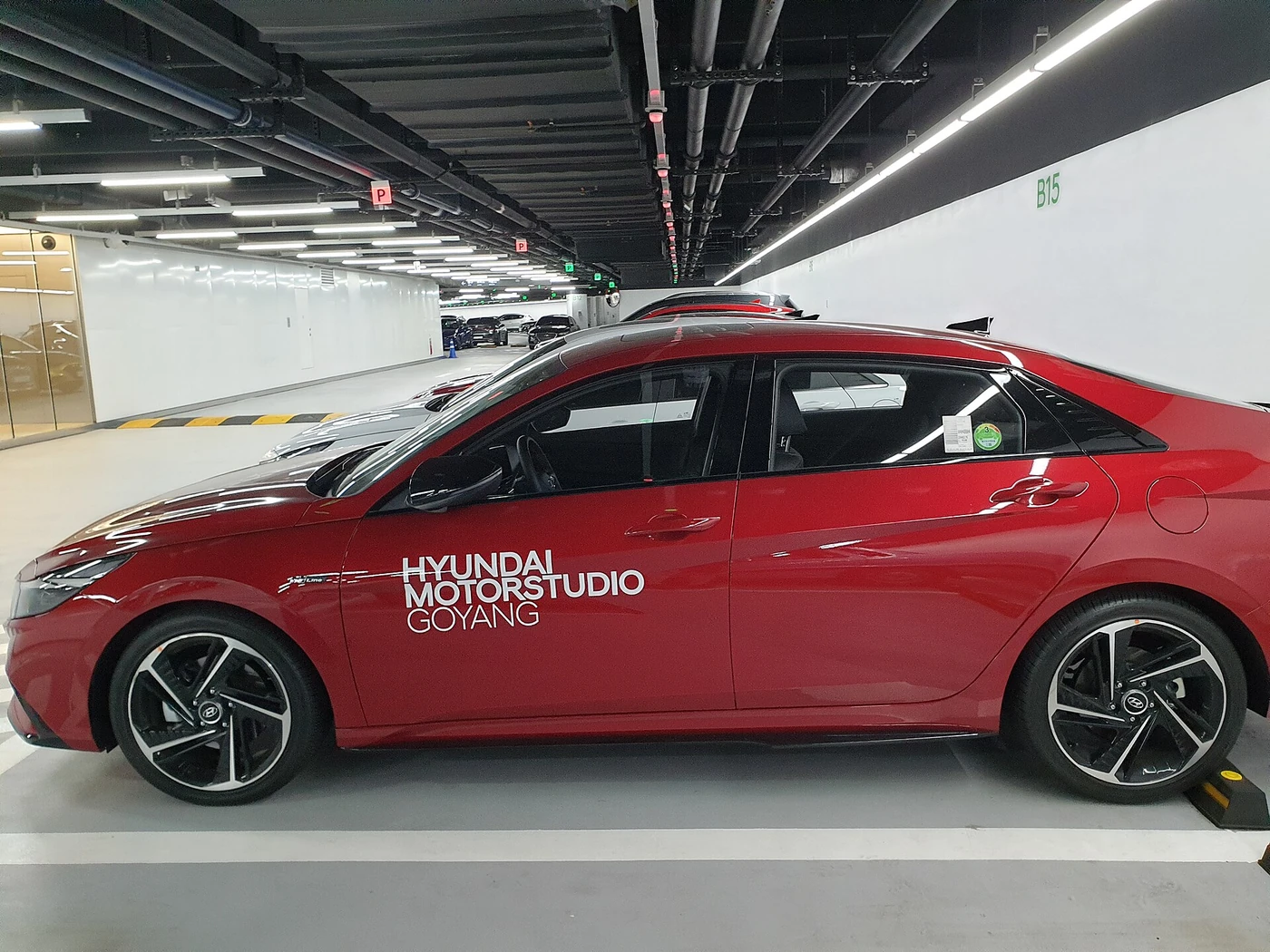
The interesting part is not simply counting those lines. Their meeting point divides the door into areas that face the light differently. One paint color can therefore appear as several contrasting tones across the side. The geometry produces the visual drama; it is not a collection of differently colored triangular stickers.
Mercedes-Benz: Letting the Volume Do More
The third-generation CLS offers a contrasting approach. In its 2018 design description, Mercedes-Benz emphasized reduced lines and edges alongside generous curved surfaces. The low-looking glazed cabin and arched body forms remain important, even without a busy network of door creases.
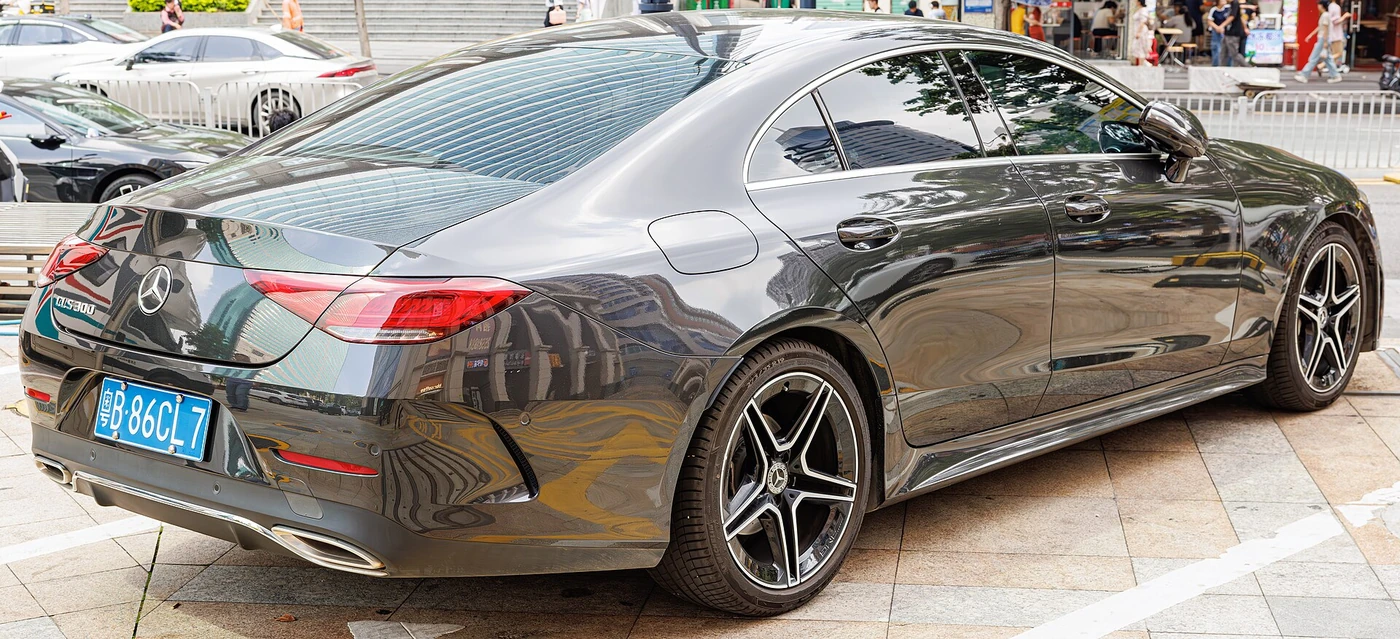
In the photograph, buildings produce plenty of visible streaks across the paint. Those reflections should not be mistaken for physical folds. The body can look visually complex in a city while the underlying surface language remains comparatively restrained.
That distinction also explains why a studio image and a street photograph can make the same design feel surprisingly different. We are looking at the shape and its reflected environment together.
BMW and Audi: Two Useful, Dated Examples
BMW’s 2012 account of its design DNA described rising lines as part of a dynamic side view. Read that as an explanation of a design approach from that period, not a rule governing every BMW today. A crease works with proportions; it does not create a brand identity by itself.
Audi’s Concept C announcement from September 2025 describes a strong shoulder and restrained surfaces organized around a single line. This is a concept-car example, not a claim about every production Audi. It shows that a technical-looking design can be pursued through reduction as well as through extra edges.
Our reading of these examples is simple: the interesting comparison is not which brand has the most lines. It is what each design asks the eye to notice first.
5. A Sketch Has to Survive the Press Shop
On paper, a line can be infinitely thin and perfectly sharp. A stamped metal panel cannot. It needs a real radius, and its material must stretch and bend into the intended shape without unacceptable defects.
The material, sheet thickness, tooling and forming sequence all affect what can be made consistently. Pulling a sheet too far can thin or split it; insufficiently controlled material movement can create wrinkles. After the forming force is released, the panel also recovers elastically to some extent. That is springback: a small change of shape after the tool lets go.
Engineers use forming simulation, tool development and compensation to manage those effects. AutoForm’s springback explanation describes why achieving the intended final geometry requires more than copying the design surface into a die.
The Line Must Work Across Separate Parts
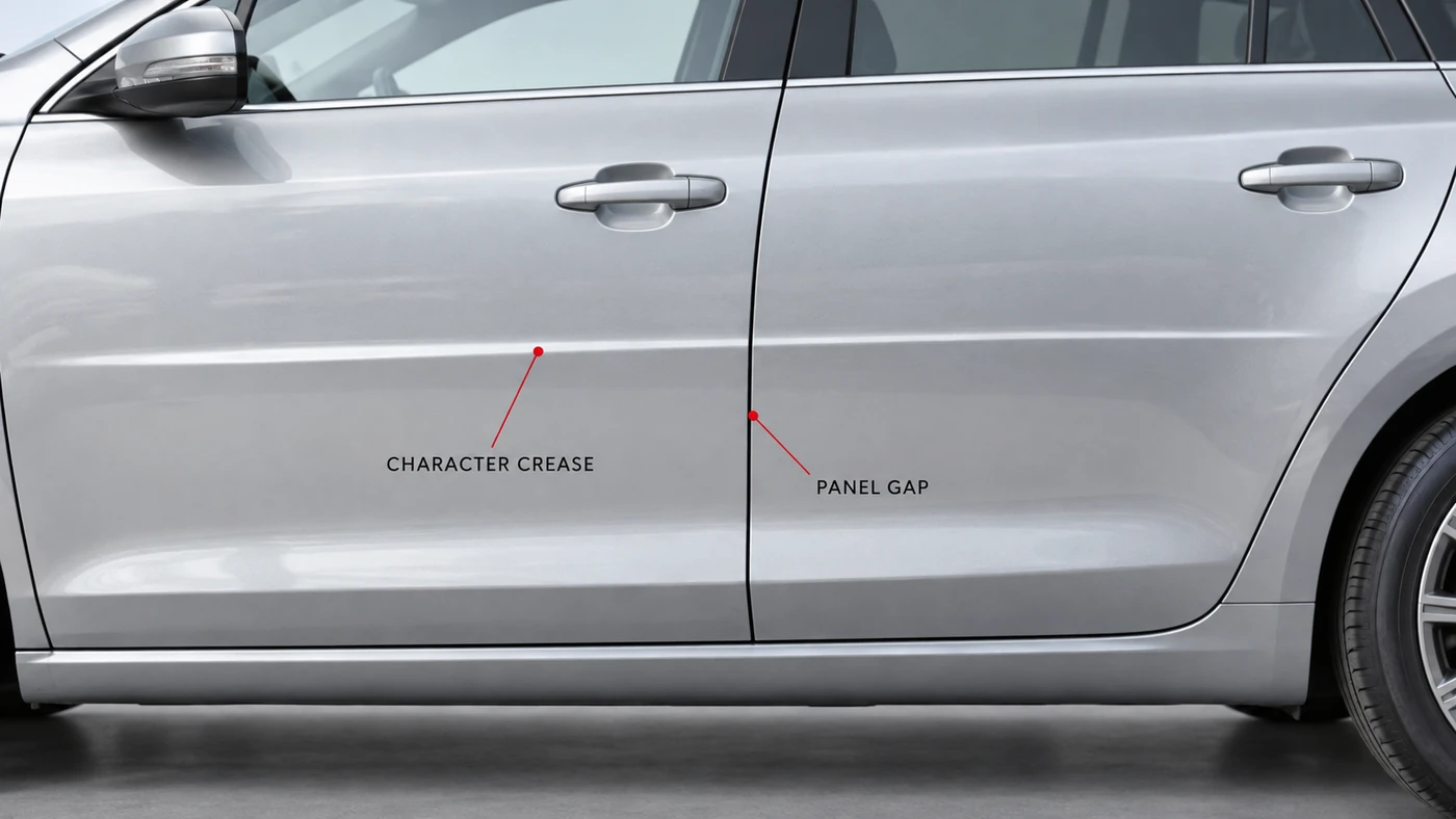
A car’s side is not one uninterrupted piece of metal. Doors have to open. Handles have to work. Fenders, doors and other panels meet at gaps. When a crease crosses one of those boundaries, its position and the surfaces around it need to work together visually.
A shut line is the gap around an opening panel, such as a door. It has a functional job that a decorative crease does not. Even where the crease appears continuous, the underlying parts remain separate.
Flush handles can reduce visual interruptions, but styling is not their only consideration. Aerodynamics, access, mechanisms and everyday operation also matter. Hiding every detail is not automatically the right answer.
A Strong-Looking Panel Is Not a Safety Rating
Changing a panel’s curvature or adding a formed feature can change its local resistance to bending. Think of how folding a sheet of paper changes the directions in which it bends easily. The result depends on the geometry and loading, not simply the existence of a line.
Engineering research on outer-panel stiffness and dent resistance treats geometry and material properties together. That is a different subject from the torsional rigidity or crash performance of the complete vehicle.
A muscular shoulder does not prove strong crash protection. For the load-bearing structure beneath the visible skin, our car structure basics guide makes that distinction clearer.
6. Fewer Lines Can Leave More Surface to Get Right
A busy design can be difficult to coordinate. A restrained one presents a different challenge: a large, quiet surface leaves the behavior of its reflections very exposed. An unintended local change in curvature may become noticeable when a reflected light strip passes across it.
That does not mean every reflection should be perfectly straight. A curved body should bend reflections, and a deliberate crease may interrupt them. The question is whether the visible result matches the intended shape.
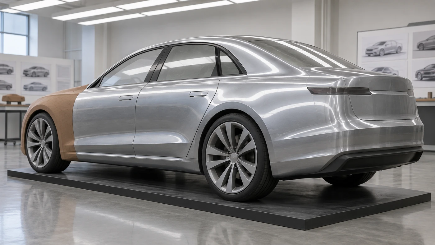
In automotive development, Class-A surfacing generally refers to the high-quality visible surfaces whose form and visual continuity require close control. The label is not a consumer score, and it does not mean that every join must be smooth: a sharp feature can be entirely intentional.
Physical models still help make those judgments. BMW’s description of its design process explains the use of full-size clay models and a silver-like covering to study the form under different lighting. Digital surfacing and physical evaluation are complementary ways to understand the same volume.
There is a production side to this, too. AutoForm’s surface-defect analysis discusses unwanted local surface changes and the work needed to identify and correct them. A shape that looks convincing in design data still has to emerge convincingly from the manufacturing process.
So fewer lines do not prove that a car was easier or harder to develop. Complexity can sit in an intricate crease network or in the precise control of a broad curve. We also cannot diagnose a faulty body panel from a single photograph full of distorted reflections.
7. Paint Changes Which Parts of the Shape We Notice
The shape does not change when a manufacturer offers the same model in silver and black. Our reading of it can change dramatically.
Silver may make broad changes in tone easy to see. Gloss black may hide some gentle transitions under diffuse light, then reveal brilliant, sharply defined reflections under a strip light. Neither color always shows the design better; the environment and finish matter.
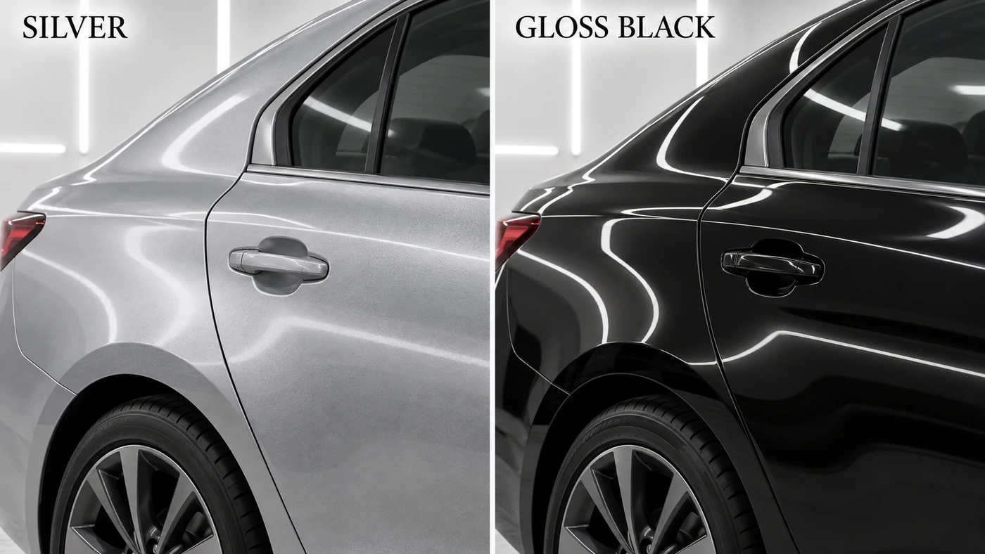
Metallic and pearlescent finishes add another layer because their pigments interact with light and viewing angle. Mazda’s Machine Gray explanation describes a particular combination of aluminum flakes and black pigment designed to strengthen light-dark contrast. That is a specific paint system, not a formula shared by every metallic finish.
This is why looking at several photographs helps. A soft outdoor light can reveal the overall volume; a more directional light can emphasize a crease. Moving around a parked car adds something a fixed image cannot: the way a highlight travels across the surface.
Will Electric Cars Make These Lines Unnecessary?
An electric platform changes some packaging opportunities and constraints, but it does not eliminate occupants, crash structures, wheels or the battery’s space requirements. Nor does it eliminate the need to give a large painted object a readable shape.
Our expectation is that brands will keep choosing different mixtures of sharp features and quiet surfaces. That is an interpretation, not a prediction that all future EVs will become either smooth or angular. The powertrain does not dictate a single visual language.
Common Misconceptions
| Assumption | A more useful way to read the car |
|---|---|
| More creases mean a better design | Ask whether the main forms remain clear or compete for attention |
| A smooth side has no character | Look for broad curves and moving reflections, not only hard edges |
| Every line should continue from nose to tail | A deliberate ending can give one area emphasis; continuity is a choice |
| A sharp-looking body must be aerodynamic | Local shape can influence airflow, but a styling feature is not proof of lower drag or downforce |
| A low-looking car must handle better | Perceived stance does not establish actual center of gravity or chassis performance |
| A dark stripe in a photograph is a crease | Check whether it is a reflection, a panel gap, trim or a real change in the metal |
Cariary Thoughts
Before digging into this topic, it was tempting to describe a side view by counting its most obvious lines: this car has a sharp crease, that one has three, and the other one is clean. That vocabulary is convenient, but it misses much of what we are actually enjoying.
The more interesting question is what happens on either side of the line. Does the metal swell toward the rear wheel? Does a shallow recess make a tall door feel less heavy? Does the reflection connect the front and rear, or deliberately separate them?
There is no need to turn a favorite car into a homework assignment. Taste can stay personal. Understanding a little of the construction simply gives us better words for why something catches our eye.
Try reading the next side profile in this order: silhouette, wheels, glass, main surfaces, then details. Finally, look again under different light. A design that seemed quiet may suddenly have far more going on than the photograph first suggested.
For us, that is the real appeal of studying character lines. We started with a line across a door and ended up noticing the whole car more carefully.
One-line Summary
A character line is not just decoration: it helps organize the surfaces and reflections through which we read a car’s proportions and personality.
FAQ
What are character lines on a car?
They are deliberate visual features in the body surface, often created by creases or transitions between curves. They help define the shape and character we see, rather than functioning like stripes applied over a finished panel.
Is the beltline the same as a character line?
Not necessarily. The beltline follows the lower boundary of the side glass. A character line may run elsewhere across the body. A shoulder or crease can visually reinforce that boundary, which is why the terms sometimes seem to overlap.
Do character lines make a car stronger?
A change in panel geometry can affect local bending behavior. It does not, by itself, establish the complete vehicle’s structural rigidity or crash performance. Those depend on much more than the visible outer skin.
Do sharp creases improve aerodynamics?
Some edges are deliberately used to influence airflow, but that does not make every styling crease an aerodynamic device. Its location, surrounding geometry and tested effect matter. You cannot read a drag coefficient from the number of lines on a door.
Why do some luxury cars have very few visible lines?
Some designers prefer to express the body through larger curved volumes and controlled reflections. It is one route to a restrained appearance, not a requirement for luxury or evidence that more angular cars are less sophisticated.
Why can the same car look different in black and silver?
Paint color and finish change the balance between diffuse brightness and reflected highlights. Lighting and viewpoint change it again. The body geometry can be identical while different parts of its shape attract our attention.
Is there an ideal height for a door crease?
There is no universal rule. Its effect depends on the beltline, wheel arches, body depth, roof and other surfaces. A proportion that works on one vehicle may look awkward on another.
Related Thoughts
- Car Design Evolution: Why Modern Cars Look So Different: the wider story of materials, manufacturing and changing design priorities.
- Car Structure Basics: 5 Essential Ideas to Enjoy Cars: the difference between visible bodywork and the structure that carries loads.
- Car Myth 4: Are Bigger Wheels Actually Better?: separating the visual effect of wheels from their engineering trade-offs.
References
The examples below describe particular designs and processes, not permanent rules for every vehicle from a brand. The six generated illustrations are conceptual teaching images; the two licensed photographs show real vehicles. Neither kind of image substitutes for engineering measurements.
- Hyundai: seventh-generation Elantra world premiere — intersecting lines and the Parametric Dynamics theme.
- Mercedes-Benz: third-generation CLS — reduced edges and sculpted surfaces in the 2018 introduction.
- BMW: Design That Moves — the brand’s 2012 explanation of dynamic side-view design.
- Audi: Concept C design philosophy — the September 2025 concept’s shoulder and restrained surfaces.
- Mazda: design and craftsmanship — the relationship between physical form and light.
- BMW: the design process — proportion development and reflective full-size models.
- AutoForm: springback compensation and surface-defect analysis — manufacturing the intended panel shape.
- SAE: aluminum selection for outer panels — geometry, material properties and panel stiffness.
- Mazda: Machine Gray paint — a specific example of paint engineered to emphasize contrast.